Victorian terrace renovation, Greens Road, Paddington, NSW, 2021
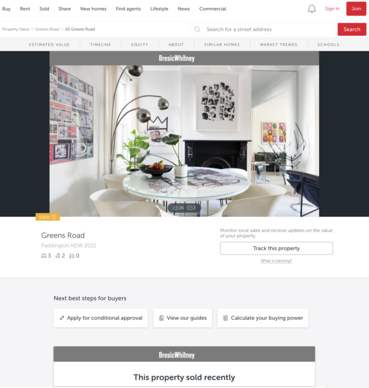
Our modest renovation of our own Victorian terrace renovation, in Paddington, NSW 2021, tripled its value when sold in October 2021
When, in 2012, Hiromi and I bought this three-bedroom, two-storey Paddington Victorian terrace house, it had rising damp and a leaking roof.
Indeed, except for what appeared to be a highly dated rear addition, appended in the 1970s or 80s, pretty much everything was close to the house’s condition as it had been built originally in 1870.


The image immediately above and to the right is how the house looks now, in contrast to its quite run-down appearance when we moved in, to the left.
As we liked it, we maintained the essential appearance of the Victorian terrace, but repaired what had become an unsafe front balcony deck, its balustrades and non-functioning gutters. We cleaned the lace, which was not even iron, but by painting it in black, now looks more like it.


Design to create value on a budget
With, like anyone else, a limited pot of money to invest in improvements, and to maximise our return, we did not want to spend beyond it.
As such, Hiromi designed the space to suit our needs to live in a modern way, that we wanted and could afford, and which would attain this goal.
In order to make the most of our own financial constraints, and to make the house reasonably and sophisticatedly liveable, other than to tidy its street-facing appearance, we decided largely not to make changes to the front, original section of the house.
First off, as we had been living in an apartment nearby, with no lift access, we anticipated that as we aged, we would want to live without the inconvenience of several flights of stairs.
Thus, for complete accessibility, to this house’s rear, she raised its floor, which had formerly been one step lower than the front of the house, to make it level throughout, from front to back, and out on to the new rear deck.
Further, we focused on the parts attracting the most natural light in which we would actually live and which would make a material difference to the quality of our non-sleeping hours.
As a consequence, our focus on remodelling only the rear part of the house gave us two lovely living areas, one front and one back, each with its own character. This gave us the best of both worlds, enabling the contrast between the traditional and the modern.
To the front, we now had a smart, open living and dining room with a fireplace in which to entertain friends and visitors, and to host sit-down dinners.
The main internal relocation: The old plan versus the new
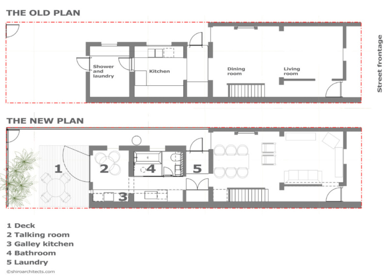
One key problem when we moved in was the lack of any harmonious flow between its spaces, making it necessary to zigzag throughout to get from the front door and out to the back garden.
Making this worse, despite the availability of plenty of light, with the street façade attracting morning sun to the east, a north-west facing backyard with generous setback to the neighbours and a skylight above the stairs, its internal layout blocked much of its benefit within.
The new space
As Hiromi loves both food and cooking, and bathing, a distinctively Japanese requirement, we wanted most of all to renovate the ground floor wet area, which encompasses both the kitchen and bathroom.
To do this, we moved the bathroom and laundry to the centre of the house, with the galley kitchen running parallel.
The talking room and rear deck
The rear location of the old bathroom became the talking room


To open up the rear, in the space previously occupied by the old downstairs toilet and shower, and feeding out to the new deck, we introduced a large single-pane glass pivot door, which looks much more modern than typical domestic bi-fold doors with their thick door frames.
Meanwhile, in the space immediately inside, at the back, we created a newer, small but airy dining room, which we called “the talking room,” in which no television was to be permitted.
Next to the cooking facilities, this was where we normally ate together, and in which we would typically spend our evenings, and would also double as an indoor-outdoor space, flowing out to the garden, when its rear door was open, if we had social gatherings on the deck.
The new kitchen
The old kitchen gave way to the new kitchen and talking room


The former kitchen, pictured left here, was capacious but its layout was not functional for the way we wanted to live, and its appliances worked but were ugly and out of date.
Beyond this space, out to the back, the shower and toilet were too small and dated and their spaces were ill-positioned, preventing light from coming into the house. This also provided an unattractive gateway to the garden.
To replace this, the new galley kitchen layout – centre image – was configured as a neat row of cabinetry along the side wall.
As the kitchen was going to become an integral part of the living space, we wanted its joinery simply to be matt white, with the mirror splashback, at right above, and mirror on the end wall making its space appear continuous.
Because of Hiromi’s enthusiasm for cooking, the bench was to be of catering grade and deeper than in most normal kitchens, giving plenty of working space and enabling generous storage for small appliances and other tools, even within a simple galley layout.
The new bathroom
The location of the old kitchen became that of the new bathroom


With a reasonably large new bathroom to be located in the house’s centre, in part replacing the former kitchen’s space, there would be no natural light feeding to the new galley kitchen.
To remedy this, Hiromi introduced a translucent panel as the wall between the kitchen and the bathroom (slightly out of view, but to the direct left in the right-hand image).
First, in plan, this would eliminate some of the wall thickness to make the kitchen space as wide as possible. However, second the translucent panel would also feed light through from the bathroom window (to the right, behind the illustrated curtain) into the kitchen, to the left of this panel, which would otherwise be deprived of any direct illumination.
Now, having been moved into the centre of the house, our bathroom would be larger and open-planned, and also, without shower screen, by using a rain shower, would feel much more spacious. Linear floor drainage separated the wet and dry areas. Loving baths in the Japanese way, Hiromi also took the opportunity to insert a sunken bath.
The old backyard acquired a new deck and leisure space


The transformation of the view of the house from Bartlett Lane at its rear is quite profound


Internal decor, downstairs, front of house
Likewise, the living space became somewhere we wanted to use


Some might have been able to live in it perfectly as it was, but the house’s decor was dated in the same way as its 1970s-80s rear extension. Consequently, we immediately wanted to remove a similarly old fashioned, pink pile carpet from the staircase and upstairs floor and to strip back the structural floorboards to paint them black.
Initially, as the detail of the Victorian-style wooden staircase was also not really to our taste, we considered painting it white. However, subsequently, we decided to try to make it disappear by instead painting it all in black against a wall also painted in black.
Given Hiromi’s love for using mirrors to amplify space, in the recess to the right of the chimney breast, she installed a floor-to-ceiling mirror, which created the illusion that we owned, or at least had a gateway through which to enter, the house next door.
Front bedroom
The front bedroom’s original pink pile carpet simply had to go


As you can see, from the image to the left above, the aged pink carpet in the front, street-facing bedroom was no more appealing than it had been on the staircase, and we had to remove it immediately. We replaced it by rubbing down and repainting the floor in black and giving the walls a clean white finish.
A fine home for a modern couple
As a couple without children, our family’s needs from a home might not match those of others who have kids. But as an experienced, accomplished architect, drilling down on the needs of others in order to accommodate the lifestyles others, not ourselves, would wish to achieve is what Hiromi does.
And she can do this to create exactly the dream home those who will live in it will want, rather than accepting an alternative that in some way limits their ambitions.
Return on investment
All up, the Greens Road house’s transformation delivered pretty much everything we desired.
Hiromi created a highly liveable house, with streamlined spaces, better circulation and a breezy indoor-outdoor connection directly through to the backyard from the front, increasing the movement of light throughout.
And its design delivered a greatly enhanced and profitable sale value – and a great return on investment.
The budget and final outcome
Being in the industry for 25 years, we know that builders regularly take advantage of clients to claim more than they should profit from variations.
In this instance, however, for the final payment from us to the builder, taking into account negative and positive variations we had asked for in the course of its construction, we had only to pay the builder a total $5 difference. And on the magnitude of expense in question – $138,500 – this was really quite an unlikely result.
But, more remarkably, in Sydney’s runaway property market of 2021, on that negligible investment, over nine short years, this modest and minimal architectural facelift tripled the value of a Paddington terrace, a return with which almost any architect, property owner or investor would be highly pleased.
